Our Logo
The Shawville Pontiacs Logo – A Symbol of Strength and Tradition
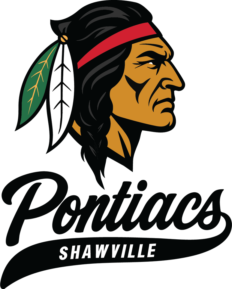
The Shawville Pontiacs crest is more than just a logo—it’s a proud emblem of heritage, resilience, and unity. The determined profile of the Pontiac chief reflects our team’s unwavering focus, courage, and competitive spirit. The feathers pay tribute to deep cultural roots, while the bold, sweeping “Pontiacs” script captures the speed, skill, and relentless drive of our players.
Anchored by “Shawville,” the logo is a statement of pride—representing a community that stands together and a team built on tradition, driven toward greatness.

A Feather Rooted in Home
One feather in the logo stands apart — colored in green and wheat gold. This isn’t just a stylistic choice. These colors are a direct reference to Shawville’s town crest, grounding the team's visual identity in its hometown roots.
By weaving civic colors into the logo, the design connects community and club — a reminder that the Pontiacs don't just represent a team, but a town.
Colors of Legacy and Spirit
The core palette — red, black, white, and yellow — draws inspiration from traditional Ottawa (Odawa) regalia, reflecting the heritage behind the Pontiac name. These colors carry deep symbolic meaning within many First Nations cultures, often representing the four directions, elements, and stages of life.
By incorporating them, the identity pays homage to the historical and cultural weight of the name it bears — honoring more than just a symbol, but a deeper legacy.
Vintage Cream – A Nod to the Originals
The soft cream tone used throughout the design recalls the aged textiles of vintage jerseys — the kind worn when the Pontiacs were first etched into Shawville’s story.
It gives the modern identity a lived-in warmth and historic character — subtle, but unmistakable. It’s the visual equivalent of lacing up old skates and stepping back onto familiar ice.